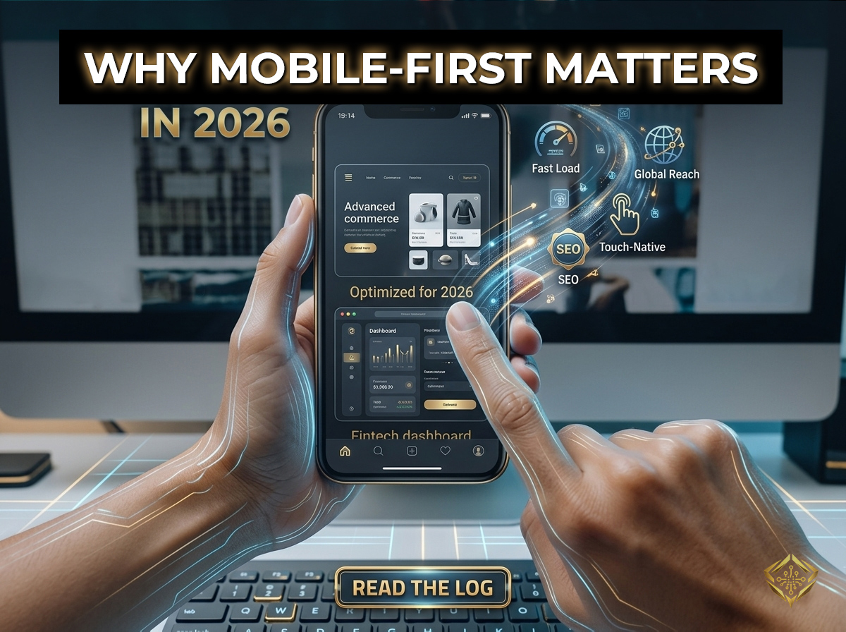
Think about the last time you looked up a local service, checked a price, or bought something online. Chances are, you didn’t wait until you were sitting at a desktop computer. You pulled your smartphone out of your pocket and expected the answer in seconds.
In 2026, this isn't just a common habit - it is the absolute standard. If you are a business owner or a creator, building your website for a desktop monitor first and treating the mobile version as an afterthought is a costly mistake.
“If your website doesn't work beautifully on a touch screen with one - handed scrolling, it doesn't work at all. Web design isn't about shrinking layouts; it's about prioritizing the user's primary screen.”
Instead of designing for a desktop first, mobile - first design flips the process completely upside down. Your website is architected for the smallest screen first. Once the mobile experience is perfectly streamlined, clean, and fast, the layout is carefully expanded for tablets and desktop computers. Let’s break down exactly why this matters for your business.
1. Google Ignores the Desktop Version of Your Site
For years, search engines analyzed both desktop and mobile layouts to determine search positions. Today, that old model is completely dead. When Google evaluates your website to decide where to rank you in search results, it only looks at your mobile site.
If your desktop layout looks spectacular, but your mobile version loads slowly, hides essential content, or scrambles your navigation menu, Google sees a broken website. Designing for mobile first ensures that the version Google grades is always getting an A+.
Bonus: The "Flow" Strategy
Mobile-First design is simply about respecting the user's scrolling behavior. On mobile, we design for a single vertical flow. On desktop, we unlock horizontal space. Don't think about "shrinking" your site—think about "stacking" it.
.grid { display: flex; flex-direction: column; }
/* 2. Desktop Enhancement: Spread it out */
@media (min-width: 768px) {
.grid { flex-direction: row; }
}
2. Micro-Moments Drive Direct Sales
Modern consumer behavior revolves around "micro - moments." These are the immediate, impulsive seconds where someone decides to buy, hire, or visit a business right now. They are standing in a shop comparing e - commerce prices, or sitting in a coffee shop looking for a specialist.
If your checkout process or contact form is clunky on a phone, those potential customers will hit the back button and visit a competitor whose site is easier to navigate. To capture these instant conversions, your layout must pass the "Thumb Zone" test.
- The Thumb Zone: Place your primary action buttons where a user’s thumb can comfortably reach them while holding a phone with one hand.
- No Pinch-and-Zoom: Text must be instantly readable without requiring the user to manually stretch the screen with their fingers.
- Frictionless Forms: Input fields should be wide, tall, and require minimal typing to get the user from intent to completion.
Is Your Mobile Experience Losing You Customers?
Mobile-first isn't just a design trend - it's your primary revenue stream. I build high-performance, touch-optimized interfaces that turn mobile visitors into loyal clients.
Explore My Expertise3. Mobile Users Demand Instant Gratification
Mobile connections, even on modern networks, can fluctuate dramatically throughout the day. A heavy desktop site packed with massive video backgrounds, giant uncompressed images, and unnecessary decorative scripts will crawl to a painful halt on a mobile device.
Mobile - first websites are built lean from the ground up. By focusing on performance on a mobile connection first, you ensure your site loads instantly across all devices. This ultra-fast loading speed directly translates into happier users, longer browsing times, and lower bounce rates.
Final Thoughts
Mobile - first design isn’t about sacrificing the look or feel of your desktop website; it’s about prioritizing how the vast majority of your audience will actually experience your brand.
By focusing on a fast, effortless mobile experience, you satisfy modern ranking rules, build instant trust with your visitors, and ensure you never miss out on a modern sale. Open your business website on your own smartphone right now and try to navigate it with just your thumb - if it feels frustrating, it is time to make the switch.
Join the Discussion (0)