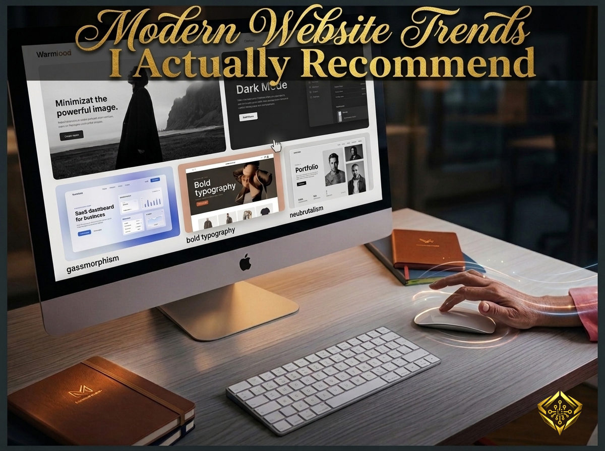
Every single year, the web design industry gets flooded with flashy new visual trends. From complex, dizzying layout animations to interactive 3D elements that spin across your screen, it is incredibly easy for business owners to get caught up in the hype of trying to look " cutting - edge. "
But here is the harsh reality: many of these trends are terrible for actual business. They bloat your source code, slow your page load speeds to a crawl on mobile connections, and leave your everyday visitors feeling incredibly frustrated and confused.
“ A great design trend shouldn't just look pretty on a designer's portfolio; it must actively serve the user, protect your mobile speed, and make the path to a conversion completely effortless. ”
In 2026, the best web design practices have shifted away from meaningless gimmicks and moved toward refined, functional aesthetics. Let’s look at the modern design trends that are actually worth your time and investment( explained simply for non - technical business owners ) - and see how they can elevate your brand authority.
1. Glassmorphism ( Sleek Visual Depth )
One of the most elegant trends dominating modern interfaces is **glassmorphism**. This style uses clever background blurring, translucent layers, and microscopic, crisp borders to make elements on your screen look like sheets of frosted glass floating over a colorful background.
Instead of making your website feel flat and basic, glassmorphism introduces a beautiful sense of physical depth and hierarchy. It lets you stack important conversion elements - like your main contact forms or key notification boxes - directly over subtle background patterns without sacrificing readability.
- Premium Aesthetics: It gives your workspace a high - end, premium feel that instantly separates your brand from generic templates.
- Clear Visual Layering: It shows users exactly which elements are interactive by pulling them forward into the visual foreground.
- Lightweight Performance: Unlike heavy graphic files, this effect is achieved entirely through a few lines of clean browser code, keeping your loading speeds incredibly fast.
See Modern Design in Practice.
Trends are only valuable when they improve performance and user engagement. I’ve curated a gallery of projects that integrate the best of 2026’s design trends - combining aesthetic sophistication with measurable results.
Browse My Design Gallery2. Native Dark Mode Optimization
Providing a dedicated dark version of your website is no longer just an optional feature for tech companies; it has become an essential user preference. Modern consumers spend hours looking at mobile screens every day, and bright white backgrounds can cause immense eye strain, especially in low - light environments.
A professional dark mode doesn’t mean just turning your background pure pitch black. It involves using deeply saturated charcoals, dark obsidians, and rich slate tones combined with contrasting typography. It creates a highly cinematic, immersive browsing environment.
Bonus: 3 Spectacular UI Interactions
Spectacular websites aren't built with static buttons. They use movement and reaction. Here are three creative interactions that prove your site isn't just "there"—it's alive.
Want the code for these? I've made theseand several other premium button designs—completely free to copy. Grab the HTML and CSS directly from my collection!
3. Massive, High-Contrast Typography
For years, websites relied on massive, slow - loading header images to grab attention. In 2026, bold and oversized typography has taken over as the primary design focal point. Designers are using huge, stylized, high - contrast fonts to deliver brand messages instantly.
This trend works beautifully because it strips away unnecessary visual distractions. When your text itself is the artwork, your message becomes incredibly clear, hard to miss, and memorable.
The SEO Advantage: Massive text elements are made entirely of standard font files, not heavy images. This means search engine crawlers can read your target keywords instantly, giving your SEO optimization a massive boost while keeping your page weight lean.
4. Bento Box Grids ( Structured Simplicity )
Inspired by the traditional Japanese lunch box, the **Bento Box trend** organizes your website's content into neat, rounded rectangular compartments of varying sizes. This layout structure is exceptional for landing pages that need to showcase multiple features, services, or portfolio highlights simultaneously.
It breaks up dense walls of information into beautiful, bite - sized visual blocks. Each little cell operates as its own self - contained story, making it incredibly fun and satisfying for a visitor to scroll through and scan your offers.
The Mobile - First Benefit: Bento grids are built on fluid layout mechanics. When a user shifts from a large desktop screen to a narrow smartphone, the square compartments seamlessly stack on top of each other automatically, ensuring your mobile responsiveness remains completely flawless.
Final Thoughts
The secret to utilizing modern web trends effectively is **purpose**. A trend shouldn't be adopted just because it looks modern; it should be integrated because it makes your website faster to load, easier to understand, and more comfortable to navigate.
By embracing clean visual depth like glassmorphism, respecting user comfort with dark alternatives, relying on crisp typography, and structuring your layouts into scannable grids, you build a powerful digital asset. You create a website that doesn't just look spectacular today, but continues to convert visitors effortlessly long into the future.
Join the Discussion (0)